Behind the scenes: the RLadies+ rebranding
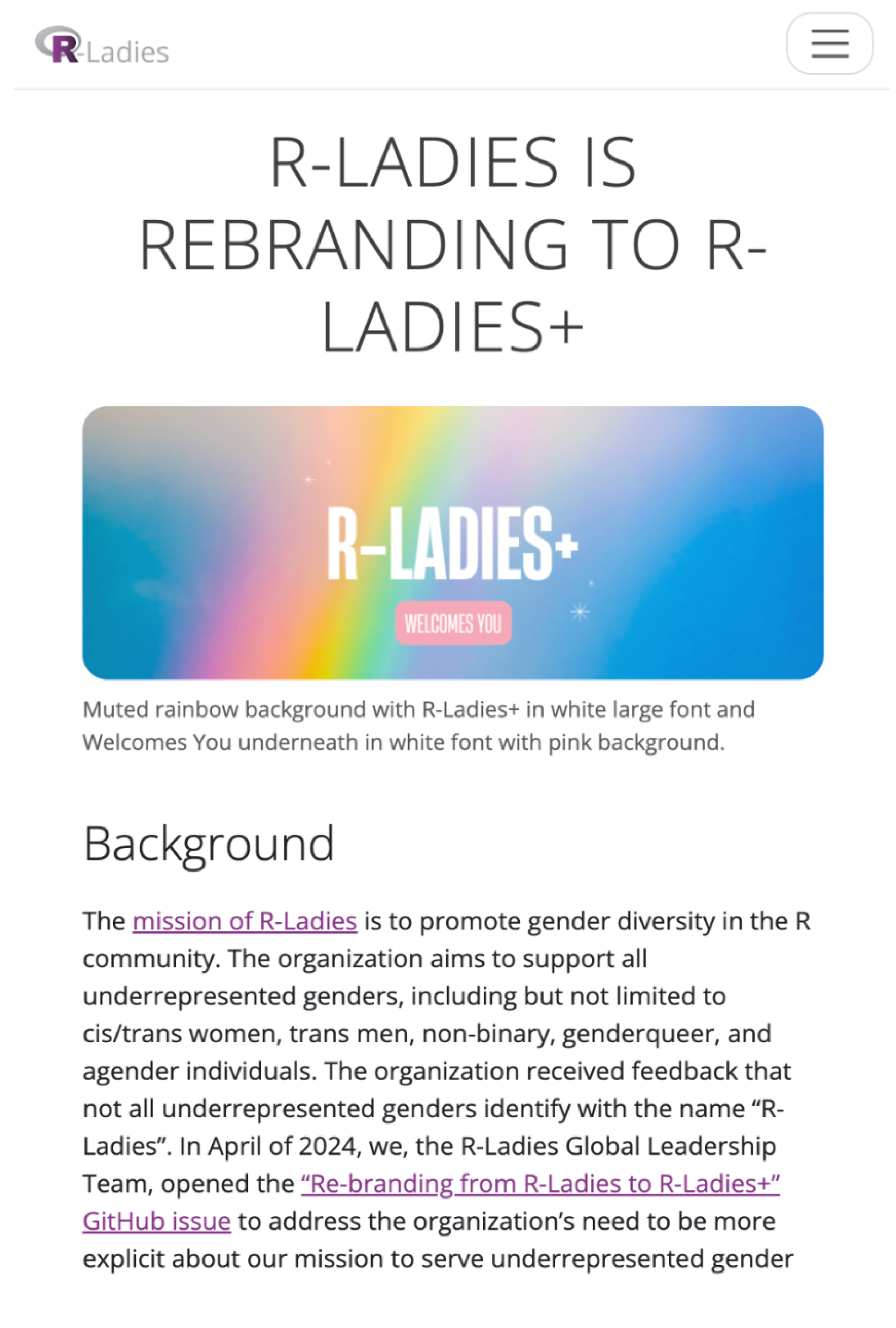
In spring 2025, the R-Ladies, a global organization which aims to bring together, support and empower people from underrepresented genders inside the R coding community, announced that they were rebranding their name to RLadies+ to reflect the community’s core values and show that underrepresented genders are, and have always been, a part of their R community. The decision for the new name and the need for a rebranding started a year earlier, and took half a year of moderated discussions within the community.
In addition to the name change, the organization was looking for a complete new visual identity, including a brand new logo, branding guidelines and templates for social media posts, slideshows, and documents. They opened calls for proposals for any graphic designers or companies worldwide that would be interested to apply to do this rebranding.
Everyone here at the Science Graphic Design team was very excited about this opportunity - we are passionate about gender equality and inclusion, as well as accessibility. In addition, we all have been or still are part of the R community, writing R scripts for our scientific analyses and data visualizations.
We should mention that this is not our usual process of getting collaborations. Usually, researchers, research groups, institutions, museums or companies reach out to us with their project. We then discuss further details with them, and prepare a quote and timeline for them to approve. However, we all are or have been in academia and are quite familiar with writing proposals. So, we prepared our proposal right away, including examples of past work with underrepresented groups and rebranding projects. We were lucky enough to get an interview with the core RLadies+ team, and were absolutely thrilled to hear they chose us to work with them on their rebranding!
RLadies+ announced calls for proposals for a rebrand.
The brief’s challenges
One of the main issues raised during the community discussions was whether the word “Ladies” should be kept or not, as many members did not resonate with it. Similarly, there was concern that the addition of the + (plus) to show the inclusion of underrepresented gender groups could be seen as just an afterthought. The decision boiled down to either RLadies+ or a completely new name. In the end, the community decided to go with RLadies+ to maintain the community’s recognisable identity and keep the rebranding incorporation as easy as possible for the individual regional chapters of the organization.
Knowing the above, we knew we needed to keep the overall look of the group recognizable (e.g., keeping a similar main colour), building on its existing presence and community trust. However, we wanted to make it absolutely clear in our design approach that inclusivity is the main focus of this rebranding and thus, the addition of the + needed to be central to our design.
At the same time, because this community consists of 200+ regional chapters/groups from 65+ countries worldwide, we needed to come up with something that was easy to implement, accessible and versatile. Finally, we also needed to account for the logo being used everywhere, including from chapters in more conservative countries where the inclusion of LGBTQI+ elements can be dangerous.

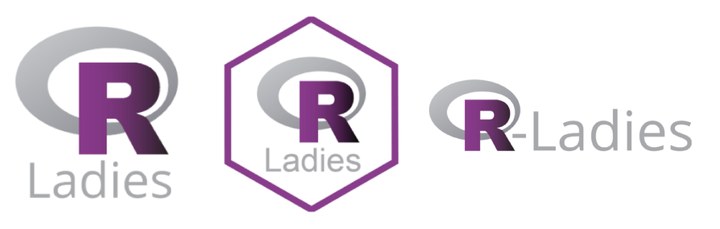
The original RLadies logo compared to the new RLadies+ logo.
Let’s go through our process behind the scenes of this rebranding that took more than half a year from start to finish. The way we approach projects overall depends on the client and nature of the project, but two main stages always come into play: the drafting and the stylising phases.
The logo
When working on branding projects, we always start with designing the logo as it is the main element of the branding, and directs the branding identity as a whole. This was the original RLadies logo:
The original RLadies logo.
Mood boards
First, we had to do some research on what’s been done before, and create some general moodboards to discuss and get inspired within our team.

Examples of the logo moodboard, showing ideas and inspiration for styles and colours.
Drafting
In the drafting stages, we worked to explore as many ideas/concepts for the logo as possible. The ideas are usually in greyscale, and look quite unrefined at this stage. We included some notes for each idea, as well as some advantages and disadvantages. We shared these with the core RLadies+ team and started a discussion with them.

The drafting stage of the logo. This involves trialling lots of ideas in greyscale.
The core team went through the draft options and added their comments, preferences and dislikes. For example, in some, the + sign was too reminiscent of the medical field, while others were found to be too complex.
We analysed the team’s feedback and refined our approach, prioritising a simple, versatile logo that would work in one colour, stand on its own, and communicate inclusivity without relying on gender symbols, pride flags, or other explicit references. This ensured the logo could be used safely and effectively in a wide range of cultural and geographic contexts, while diversity and representation would be reflected through supporting visuals and branding.
After several iterations, guided by the team’s feedback and a strong focus on versatility, we arrived at a design that met our goals. This is what we came up with! The R is still prominent in the design, as in the original logo, but now it is made up of the + sign (that is in turn made up of the letter L for Ladies). The logo is recognisable by its shape, and that allows for changes in colours or the insertion of images inside the logo parts for maximum versatility and adaptability. The team loved it unanimously and so we moved on with this concept!

A breakdown the RLadies+ logo showing the icons versatility and representation of ‘R’, ‘+’, and ‘L’ within its shape.
Stylising
In the stylising stage, we had to finalise and finetune the shape and colour of the logo mark (i.e. the icon part of the logo) as well as offer options for the logo type (i.e. the text part of the logo).
For the former’s colour, the RLadies+ team had asked us to keep purple as the main colour for the rebranding to aid in the groups recognizability. So we came up with alternatives that were still purple, but with a more modern look. For the latter, we offered options for the font ranging in roundness, thickness and overall style. We wanted the look to be friendly and open but still clean and professional. After some back and forth, the team landed on the use of the Urbanist font for the logo type. The RLadies+ team and we were ecstatic with how the final logo turned out!
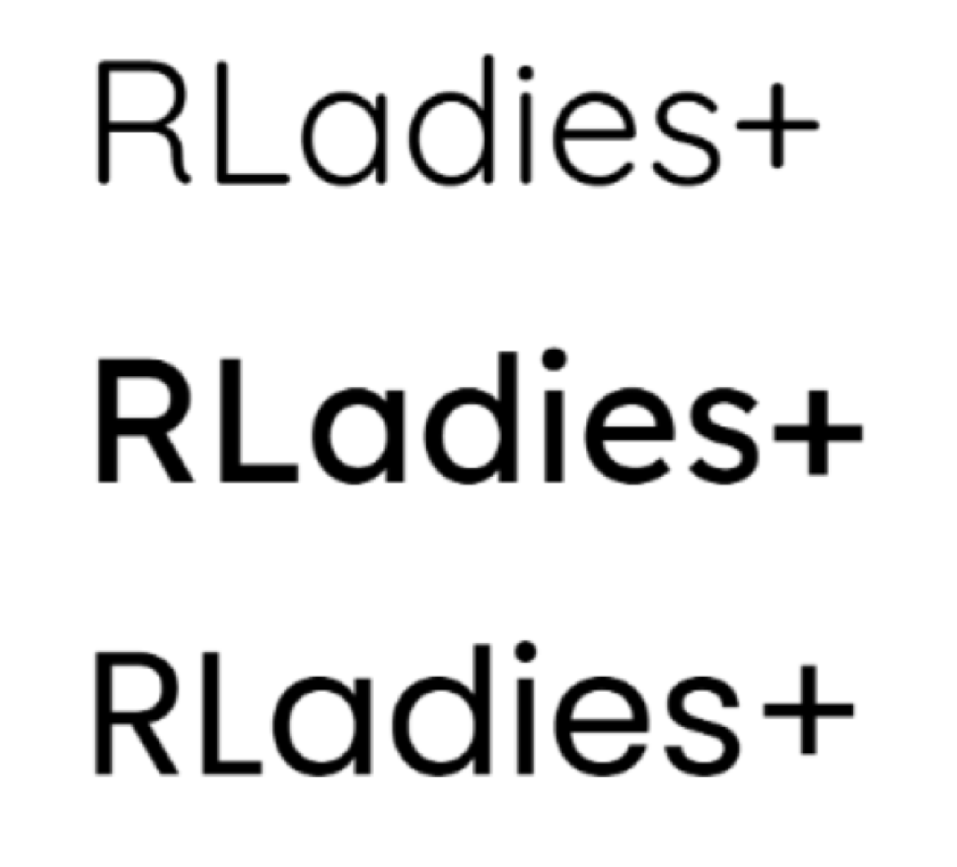
Trial fonts for RLadies+.

The new RLadies+ logo!
Branding
Once we had the logo, we started working on the branding- the organization’s unique and consistent visual identity. These are a set of guidelines that include a colour palette, typography, logo usage, etc. We needed to make sure the branding kept in line with the logo’s minimal and welcoming look as well as its versatility. Above all else, we wanted to make sure that the branding was accessible, and easy to apply.
Typography
While the logo type uses Urbanist, we wanted to make sure the main font used for the groups templates (e.g., social media posts, slidedecks, etc) was readily available for everyone. Therefore, we turned to Google Fonts to find our ideal font, as this platform has thousands of options that are free to access, download and use for everyone, and are already incorporated into Google Suite (Slides, Docs, Sheets etc.). We also wanted a font that was accessible, had an approachable and friendly group, and had a variety of styles (from Light to Black and anything in between). Based on this we chose Poppins.
Colour palette
The colour palette also needed to be friendly, open, and above all, accessible. We came up with three colour palettes based on purple as the main element. In all options, we included accent colours that contrasted enough with light backgrounds as well as dark backgrounds. We also made sure the colours were distinguishable for everyone, independent of colour blindness deficiencies. After some discussion, the RLadies+ team landed on this colour scheme!

Possible colour schemes for the new RLadies+ branding guidelines.
Guidelines
Finally, we designed a short booklet with all the above, as well as some tips, tricks, and things to avoid for use of the logo, colours and text for accessibility.
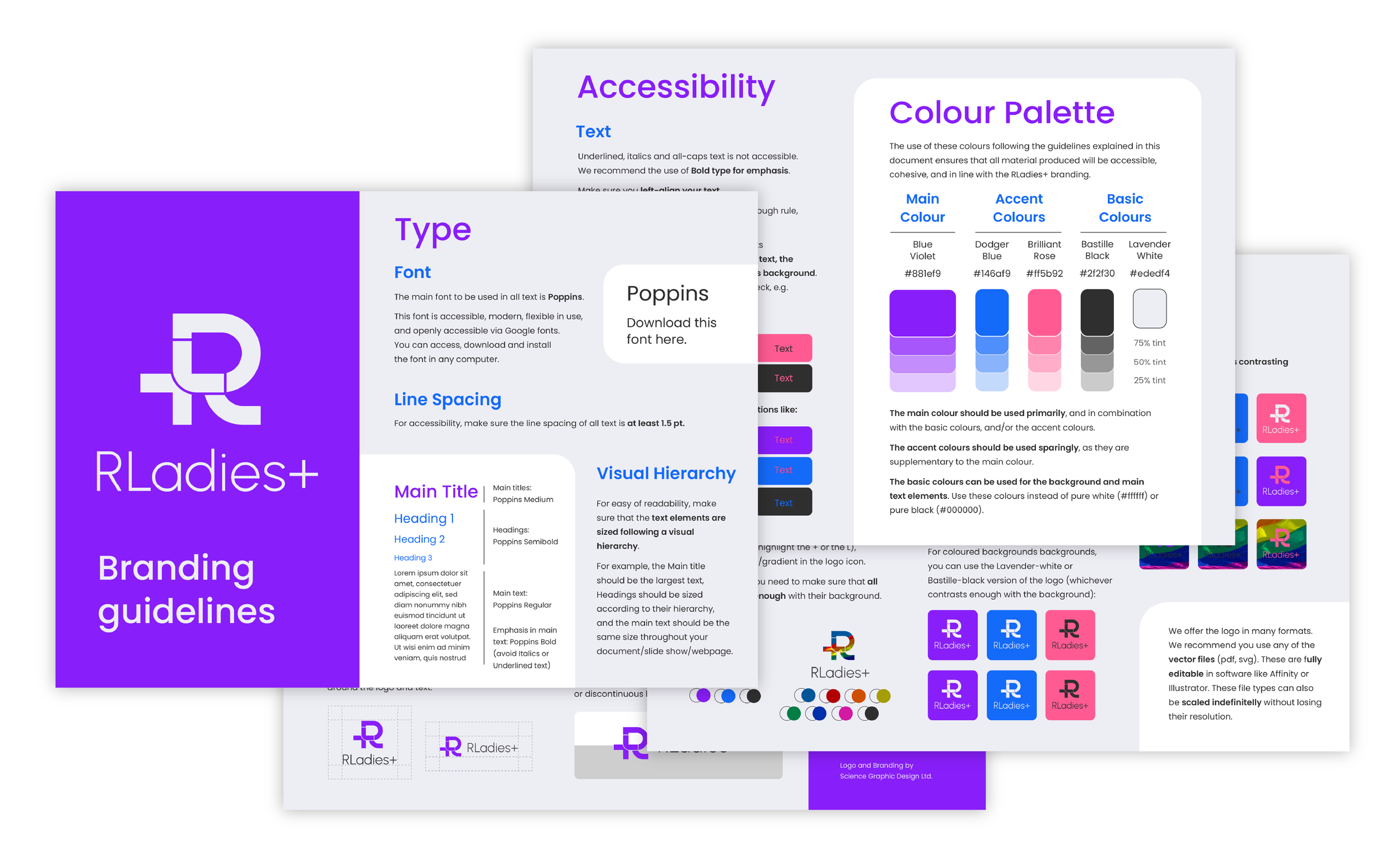
Accessible branding guidelines for RLadies+. It shares accessible colour combinations, use of visual hierarchy, font, and line spacing.
Templates and manuals
Based on the branding guidelines, we designed a set of templates for the RLadies+ community. These included slidedeck templates, templates for social media posts, document and certificate templates, regional hex logo templates for the regional chapters, as well as files that make it easy for the community to edit the logo e.g. by adding an image in the icon. These were built in various pieces of software (e.g., Google Slides, Affinity Studio and Canva) that were available to everyone.
We wanted to make sure the community found it as easy as possible to apply the branding guidelines and use the templates we made. For this, we made extensive how-to manuals for each type of template. These include a short explanation of the software used, the organization of the templates, some pertinent options for editing, and finally exporting information.
In the end, we were also called to join the team’s meeting to take everyone through the materials, and our overall approach to the rebranding process. This was followed by a Q&A session.

Examples of RLadies+ instruction manuals for the rebrand and examples of presentation slides and social media posts.
Final thoughts
It was an absolute pleasure to work on this project that aligned with our core beliefs of accessibility and inclusivity. The team was wonderful, and we are overall so excited about the final product. We can’t wait to see the RLadies+ community use the new branding for all the amazing new chapters, meetings, workshops and posts they make! In fact, we got to see a sneak peak of their new website, which is now live at https://rladies.org/, a big difference from the old look!

Before and after of the RLadies+ website!
We strongly recommend following the RLadies+ social media and stay up to date with their work at @rladiesglobal (Instagram) or @rladies.org (Bluesky).