
Creating accessible graphics
Science thrives when it is communicated effectively. As scientists, we often need to design graphics to communicate the outcome of our research, either via conference posters or presentations, paper figures and graphs, or to a wider audience through social media. Good graphics can really influence how many people engage with your research and how widely your message is distributed. However, our research cannot be truly communicated effectively unless it is accessible. As scientists and science communicators, it is our responsibility to create a more inclusive community and generate content people with disabilities can access. You don’t have to choose between creating visually appealing designs and creating accessible designs; in fact, the two often go hand in hand.
Many times we think of creating accessible graphics as making them colourblind friendly but, while it’s true we should account for this, it is not the only aspect we should think about. If you have no clue at where to start when making accessible designs you’ve come to the right place. Below I describe what I’ve learned so far about creating accessible graphics.
Here’s my top ten tips to make your graphics more accessible:
Tip 1. Creating an accessible graphic should not be an afterthought, it should be considered since the start of the design process.
A truly good design should be as inclusive as possible and therefore accessibility should be considered since the conception of your graphic. By doing this, the design process might even be easier and you won’t have to go back to redesign your entire graphic at the end when you realise it’s excluding a number of people.
Tip 2. Choose a font that is easy to read
When it comes to choosing a font, there’s a million options out there. If you’re making something like a figure, a poster or a graphical abstract, it is generally recommended that you choose a sans serif font (e.g., Arial, Helvetica). Serif fonts, like Times New Roman, have little strokes at the edges of the letter and are recommended for longer pieces of text (like a paper or a book). Sans serif fonts are chosen for graphics because they are easier to read, especially for people with dyslexia.
It is important that whatever font you choose is large enough. This of course depends on the type of graphic you’re working on. If you’re making a figure for a paper, go check the journal figures guidelines- they’ll usually specify the minimum font size you should use. If there are no specified requirements, try viewing your graphic at the “real” size people will see it. For example, if you’re making a graphical abstract for a journal you can go find their previously published abstracts and scale down your own abstract to the size it’ll be displayed on their website. Can you still read your text?

When making scientific graphics, choose sans serif fonts (e.g., Arial) instead of serif fonts (e.g., Times New Roman)
Tip 3. Keep consistent levels of headings
It is important to structure your graphics in a logical fashion. A simple way to give structure is to keep consistent formatting in your different levels of headings. Headings are going to be bigger than your main text, they may also use bold letters or have distinct colours. You might even choose to have different fonts for the headings and main text (don’t overdo it though, only use 1 or 2 fonts!). The precise formatting of your headings and main text is up to you, but make sure they remain consistent throughout.

Always keep consistent formatting if your different levels of headings
Tip 4. If you want to highlight something, use bold letters instead of all caps or underlined text
The British Dyslexia Association recommends emphasising text by using bold letters, rather than italics, capital letters or underlined text. According to them, italics and underlined text causes the text to appear overcrowded and all caps (and small caps) are harder to read.

Add emphasis to your text with bold letters, rather than italics, underlined text or capital letters
Tip 5. Avoid long paragraphs & use bullet points instead
I can’t count the number of times I’ve walked into a conference poster session and I’m surrounded by dozens of posters that are essentially walls of text accompanied by one or two figures. I know it’s tempting to write everything you know about a subject or every single detail of your research when making a poster, trust me- I’ve been there. However, if you do that, chances are:
People won’t read your poster,
They will get bogged down on the details and miss the main point of your research,
You won’t get as much engagement as you could have
If this happens, you are not effectively communicating your research. From an accessibility standpoint, long pieces of text are not easy to read for dyslexic people. Instead, make sure you use as little text as possible. Use bullet points and concise ideas.
Consider the language you’re using as well. When making conference posters and graphical abstracts you should not use the same technical writing style you’d use for a paper. Instead, use more accessible language that can be understood by a wider audience.

Use concise text in bullet points rather than long paragraphs
Tip 6. Choose colours that are contrasting enough
I am sure I’m not the only person that has had to sit through a presentation where the slides have a bright blue background and red font. Colour combinations like the ones below are headache-inducing and, many times, illegible.

It is clear that the colour combinations shown above should not be used. Why? Because the colour of the text and the colour of the background are not contrasting enough. How do we decide what’s the appropriate contrast? The Web Content Accessibility Guidelines (WCAG 2.1) have you covered.
The WCAG have two levels of colour contrast:
Level AA:
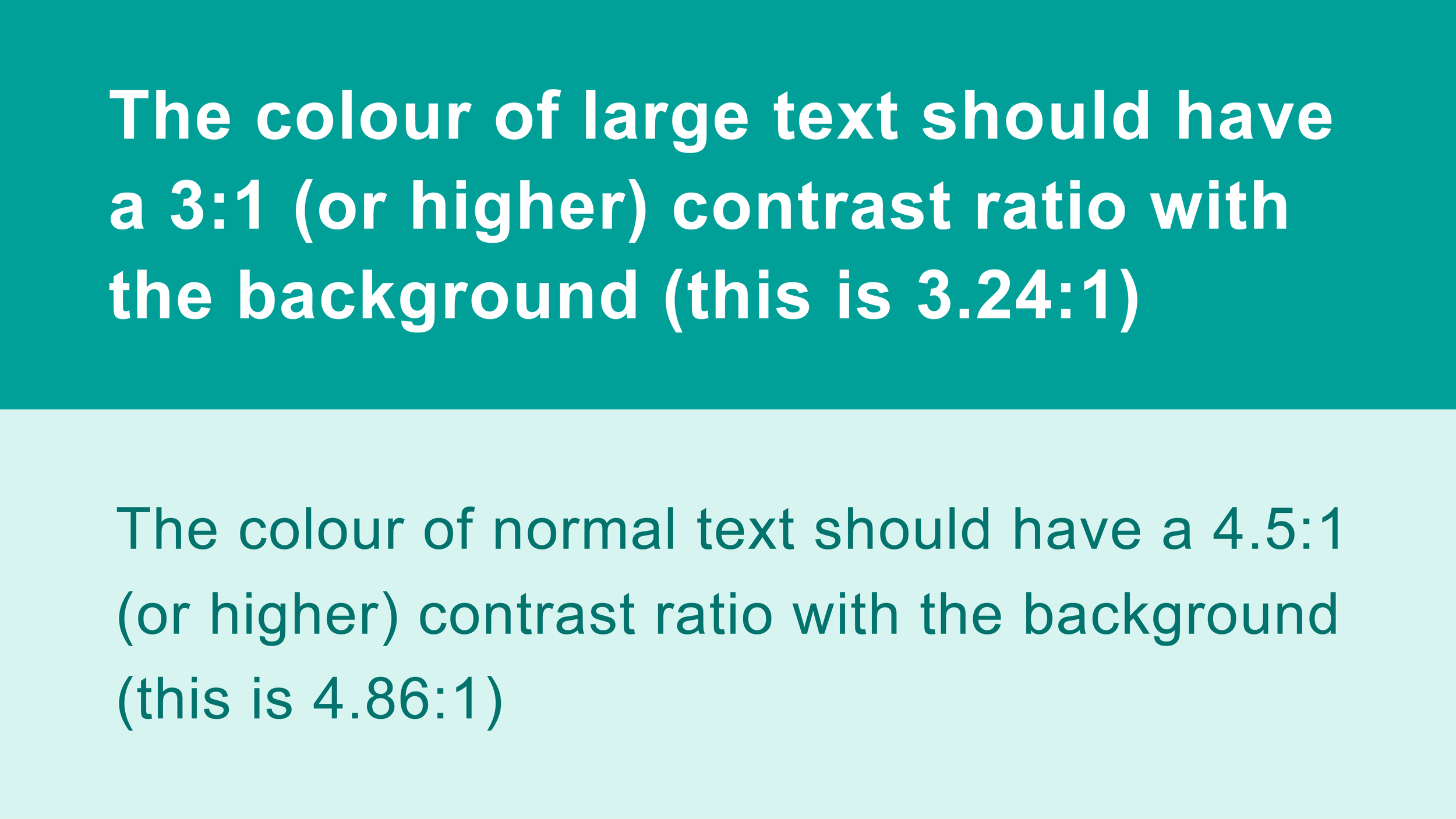
Normal text should have a contrast ratio of 4.5 : 1 (or higher) with the background
Large text should have a contrast ratio of 3 : 1 (or higher) with the background
Level AAA:
Normal text should have a contrast ratio of 7 : 1 (or higher) with the background
Large text should have a contrast ratio of 4.5 : 1 (or higher) with the background
Level AA of WCAG 2.1

Level AAA of WCAG 2.1
Similarly, the colour of graphics (like logos, charts. etc.) should have a contrast of at least 3 : 1 with the background colour.

Graphics should also have enough contrast with the background
So this all seems pretty straightforward but, how can you actually check the contrast between your foreground (e.g., text or graphics) and your background?
There’s two things you need to do:
Obtain the colour code of your background and foreground
Check their contrast in an online colour contrast checker
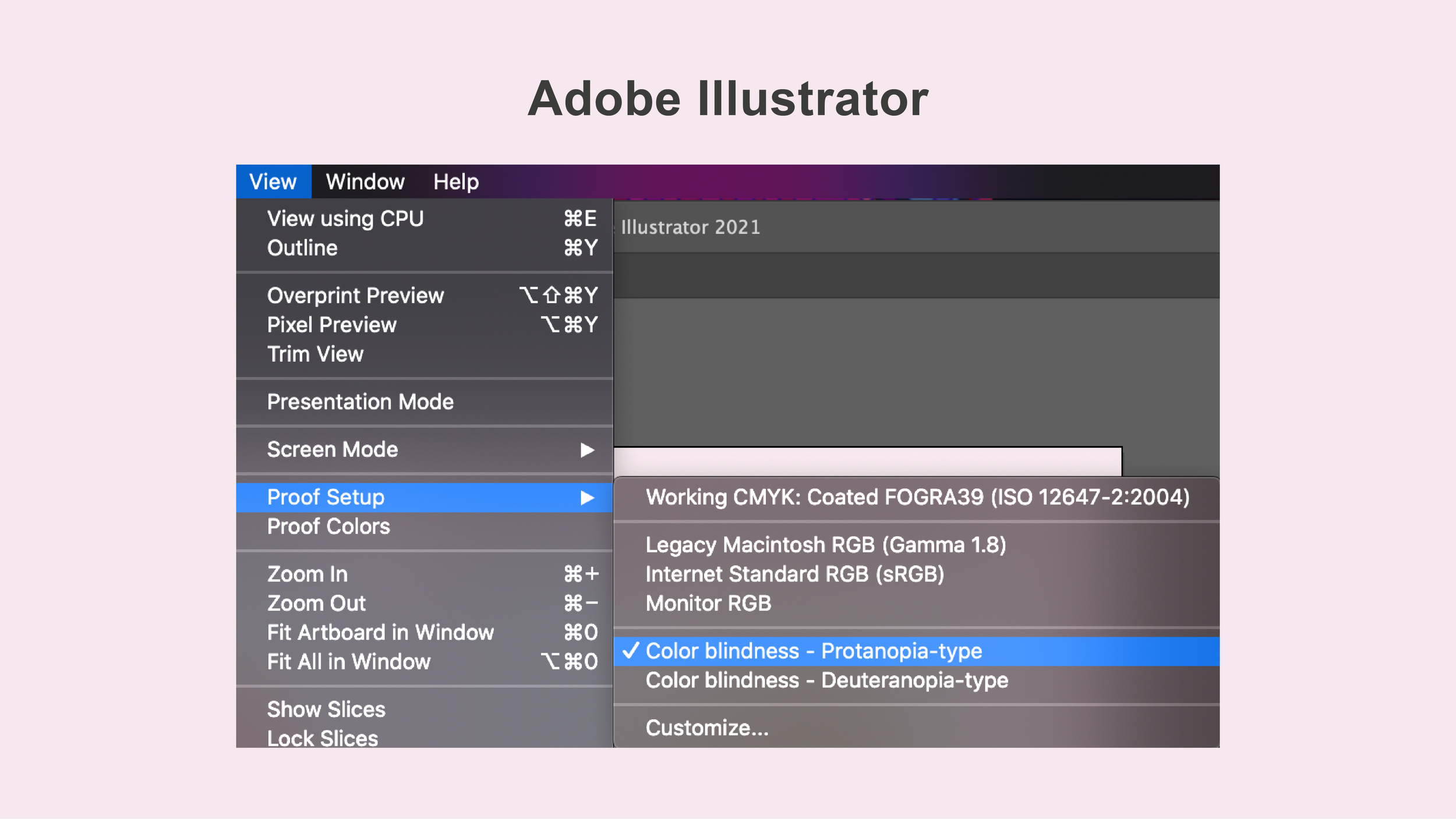
You can obtain the code of your colours in whatever software you’re working on, commonly in the same section you choose your colours (perhaps in some advance colour settings depending on the software, see a couple of examples in the image below). You can also upload images to various websites to obtain the colour codes.

Examples of how to obtain colour codes in Adobe Illustrator and Keynote
Once you have the codes of your colours, you can go to an online colour contrast checker to see if your colours are contrasting enough. The good thing is that many of these sites have built-in the Web Content Accessibility Guidelines, so no need to remember the actual values! My go-to website for this is Colour Contrast Checker, because it nicely depicts what your colours look like and it tells you whether they are contrasting enough based on the accessibility guidelines.

You can clearly see whether your colours are contrasting enough in the Colour Contrast Checker
Tip 7. Avoid overly complicated backgrounds
Busy backgrounds make reading your text more difficult, especially for dyslexic people, and can distract from your message. Instead, try using a solid background (with enough contrast with the foreground).
Avoid using a pure white background with a pure black font (or vice versa). It can be too jarring to look at. Instead, you can use an off-white background and a dark grey font.

Avoid using a combination of pure black and pure white!
Tip 8. Make sure your graphics are colourblind friendly
It is always important to make sure your graphics are colourblind friendly, especially if you are relying on colour to convey meaning! For example, if you are colour coding different groups on a plot and you don’t check whether your colour palette is colourblind friendly, the meaning of your plot will be lost. You can clearly see it in the example below.

Remember not everyone can see colours the same way
To avoid this from happening you can either:
Use a colourblind friendly palette when building your graphics
I love using ColorBrewer to obtain colourblind friendly palettes when visualising data, especially because you can choose a colour palette that suits the type of data you’re using (e.g., sequential, diverging, qualitative).
You can also create your own colourblind friendly palettes (and check your colour contrast) using the accessibility tools of the Adobe Color Wheel
There are also R packages that either provide you with colourblind friendly palettes or simulate colourblindness, like colorblind (ggthemes package) and RColorBrewer
Try using a colourblindness simulator
Viz Palette allows you to see what your colour palette would look like to a person with colourblindness
Coblis and colorblindr are online colourblindness simulators that allow you to upload your own images
Specialised software, like Adobe Illustrator, also have built-in colourblindness simulators
This is how you access the colourblindness simulator in Adobe Illustrator
Tip 9. Don’t only rely on colour when you need to distinguish groups
Even when you’ve made sure your colour palettes are colourblind friendly, it is important you don’t only rely on colour when trying to distinguish groups. You can use other strategies, like using different shapes or directly labelling the groups in a plot. There’s many reasons to do this. Imagine, for example, someone prints out your plot in Black & White- if you were only relying on colour, chances are the plot is now unreadable. It is important we improve the legibility of our graphics as much as we can. Another way to do this is to include a short sentence that sums up the main take home message of the chart.

Make sure to not only use colours when differentiating groups, but distinct shapes & labels
Tip 10. Always add Alt-Text to your images and graphs
Alternative text, or alt-text, is a short description of an image or graph which is read out loud to people who use screen readers. This allows them to understand the content of images which they wouldn’t have been able to obtain otherwise. Oftentimes, if no alt-text is available, screen readers will read the name of the file- this is clearly not useful. Therefore, we need to add an informative short description of our images in the form of alt-text.
What should we include in this alt-text? First of all, it should be a concise and informative description- don’t make it overly long! Remember it’s being read out loud to people. With that in mind, Amy Cesal created a very useful formula that can help us come up with the best alt-text possible. It includes the following:
Chart type
Type of data
Reason for including the chart
Link to data source
A number of excellent examples and further description on the use of alt-text can be found in Amy Cesal’s Nightingale article.
Once you know what you want to include in your alt-text, how do you actually add it to your image? This varies from site to site. If you’re building a website, this will often be found alongside the image properties. If you’re uploading an image to social media, there’s several options. Here you can find the instructions for Twitter and Instagram.
Website: Find the option below the image that says "Add description". Click on it and write a short, informative description of your image.
Mobile app: There is an option on the bottom right corner of the picture that says "+Alt". Click on it to include the description of your picture.
Instagram: Follow these steps:
Create a new post, select your picture & filter,
Click on Advanced Settings,
Click on Alt Text,
Write the description of your image

How to add alt-text in Twitter

How to add alt-text in Instagram
I hope you have found these tips useful, and I’ll make sure to update this site whenever I learn any more ways to make graphics more accessible!
All the information found here was compiled from the following excellent sources:
British Dyslexia Association. “Creating a dyslexia friendly workspace”. Retrieved March 2022. https://www.bdadyslexia.org.uk/advice/employers/creating-a-dyslexia-friendly-workplace/dyslexia-friendly-style-guide
Cesal, A. “Writing Alt Text for Data Visualization“. Retrieved March 2022. https://medium.com/nightingale/writing-alt-text-for-data-visualization-2a218ef43f81
Cesal, A. “Writing Alt Text for Data Visualization“. Outlier Conference 2021. https://www.youtube.com/watch?v=nBcR95S0F0o
Elavsky, F., Le Gassick, L. and Fossheim, S. “Are your visualizations excluding people?“ Outlier Conference 2021. https://www.youtube.com/watch?v=SWB-KLXN-Ok&list=PLAm5TIX-yz7IkKOUcStM_vl8AD0S9v0co&index=9
World Wide Web Consortium (W3C). Web Content Accessibility Guidelines 2.1. Retrieved March 2022. https://www.w3.org/TR/WCAG21/
Want to learn more about accessibility? Make sure to follow these accessibility experts on Twitter:
Anna E. Cook: @annaecook
Frank Elavsky: @FrankElavsky
Amy Cesal: @AmyCesal
Sarah Fossheim: @liatrisbian
Larene Le Gassick: @LareneLg