
How do you make your first scientific poster?
Making a poster for an academic conference for the first time can be daunting. Believe me, I’ve been there. You might very well have the technical skills to make one; however, I find that the trickiest part of making a poster is knowing what to put in it. The first time I made an academic poster I was an undergrad and had never gone to a conference before. I spent hours trying to make sure everything I wanted to say was included and second guessing each sentence, figure and table I wanted to include. When I finally finished it and printed it, I excitedly went to show it to my sister (who at the time was doing a PhD) and she told me: “If I was at a conference, I would not read your poster”. I was floored. Didn’t she know how much time I had spent working on this poster? Surely everyone would want to read in minute detail how the third molars of gomphotheres varied between genres.
Turns out, I was wrong. The poster was terrible (check it out for yourselves below) and almost ten years after making it I can see absolutely everything that is wrong with it (hint: the massive wall of text is number one). But I was an undergrad and didn’t know any better. So this blog post is an instruction manual to my undergrad-self and to everyone that has a poster to make and has no idea where to begin. My advice is related to both the poster’s content (i.e., what to put in the poster) and the layout (i.e., how to distribute the content in the poster). Also, at the end of this blog I’m going to walk you through how I took my old undergrad poster and changed it into something much better.
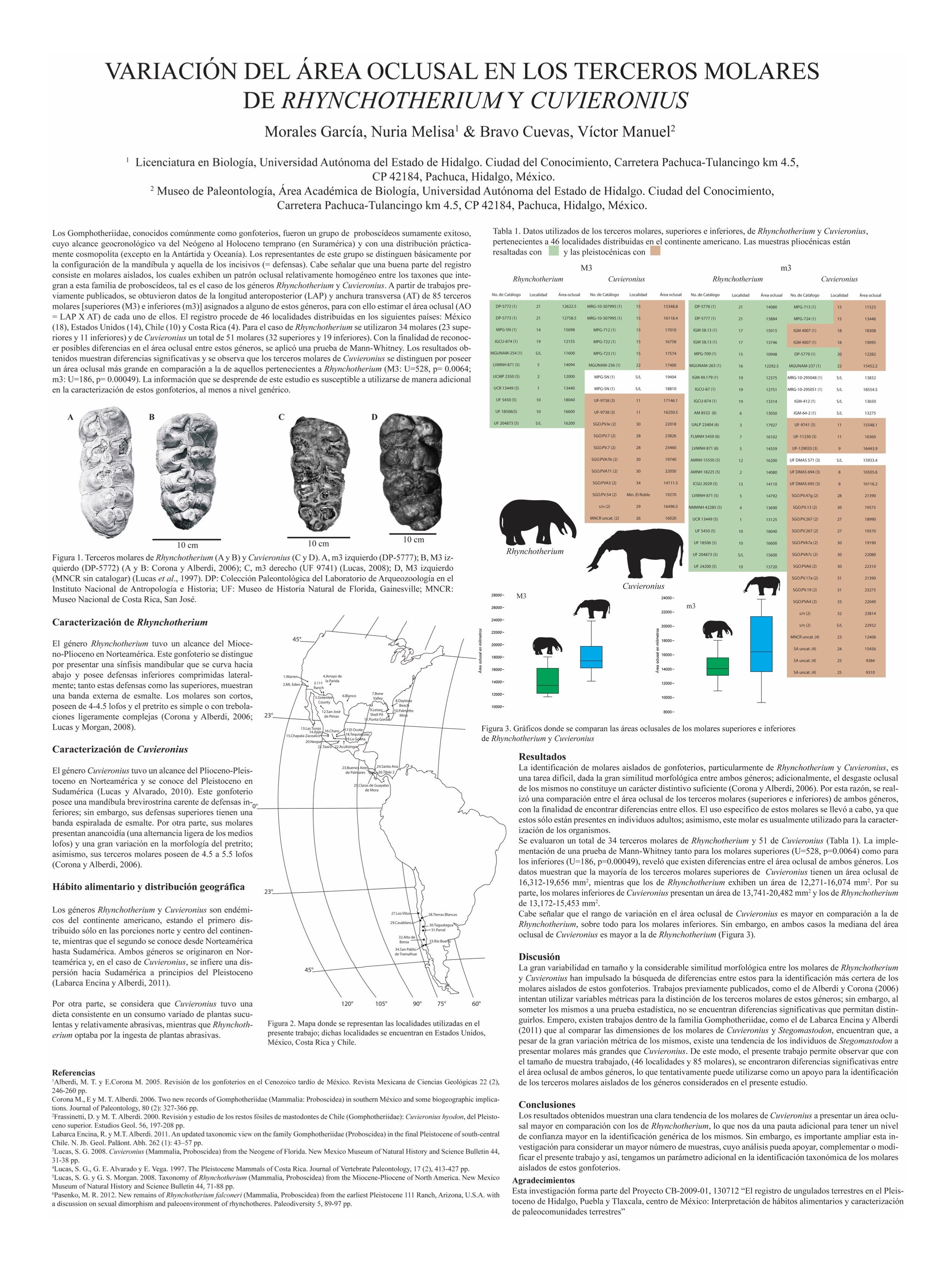
My first conference poster. A horror story involving way too much text, lots of unnecessary detail and overall bad design.
Here are my recommendations for making a scientific poster:
First, the basics:
Look up the poster requirements for the conference
Every conference is different and, if you go to their website, they should have their poster specifications. They will tell you how big your poster should be, whether you should make it landscape or portrait, and how your poster is going to be attached to the poster board. If they don’t have this information, make sure to email the conference organisers. If you’re attending a virtual conference, it is still important to know the size and orientation of the poster, and whether attendees will be able to zoom into your poster or not. For online conferences, I prefer doing posters in landscape mode.
If you use something like Adobe Illustrator and you’re going to print this poster out, make sure to choose a CMYK colour profile- this means that the colours you see on your screen will still look the same when you print the poster.
Go for a sans serif font (e.g., Arial or Helvetica) rather than a serif font (e.g., Times New Roman). Sans serif fonts are easier to read, especially for people with dyslexia.
Make sure your font is big enough to read. Posters are not about trying to jam as much text as possible into a piece of paper, so there’s no need for you to choose a small font size. People should be able to comfortably read your poster from about half a meter or a meter away. If you have text in your poster (maybe within a figure) that is too small to read- is it even worth having it there in the first place? It just increases clutter.
Use whatever software you are comfortable with. If you have a tight deadline and have never used Adobe Illustrator or LaTeX before, don’t waste time trying to learn it- use PowerPoint instead! The key to making a good poster is not the software you use, but knowing how to design it.
Always prioritise accessibility in your design! You can read all my recommendations on the topic in my blog post on accessibility.
Keep this in mind: a conference poster is not a paper
Posters don’t strictly need to be divided into Abstract, Introduction, Materials & Methods, Results, Discussion & Conclusions. You can still largely follow this structure (it is after all, a logical way of communicating your research), but:
Don’t feel the need to have a text box with each and everyone of this sections. In fact, don’t put your Abstract in your poster. You’re just repeating yourself twice and wasting space.
You don’t have to have headings that say, for example, “Results” or “Discussion”. You can change them for more descriptive titles. Instead of having a title that says “Results” you can have one that says “We found that…”.
The language that you use for scientific papers is not the same language you should use for posters. Trade the overly-complicated language of scientific posters for more accessible language.
Papers have long paragraphs with lots of supporting information. Posters should only show what’s strictly necessary.

A conference poster needn’t have the same sections as a paper. Reduce the amount of text in your poster and make sure the figures are the centrepiece. You can also try using more descriptive headings for an easier reading experience.
Now, what do you actually put (or don’t put) in the poster?
Text
What text should you include?
I want you to write down answers for the following five questions and I want you to use the simplest language possible. Use only one or two sentences per point:
What is the reason for your study? or a short, descriptive sentence on the relevant background
What is your research question?
What did you do in your study?
What was your main finding?
What is your take home message/conclusions/future directions?
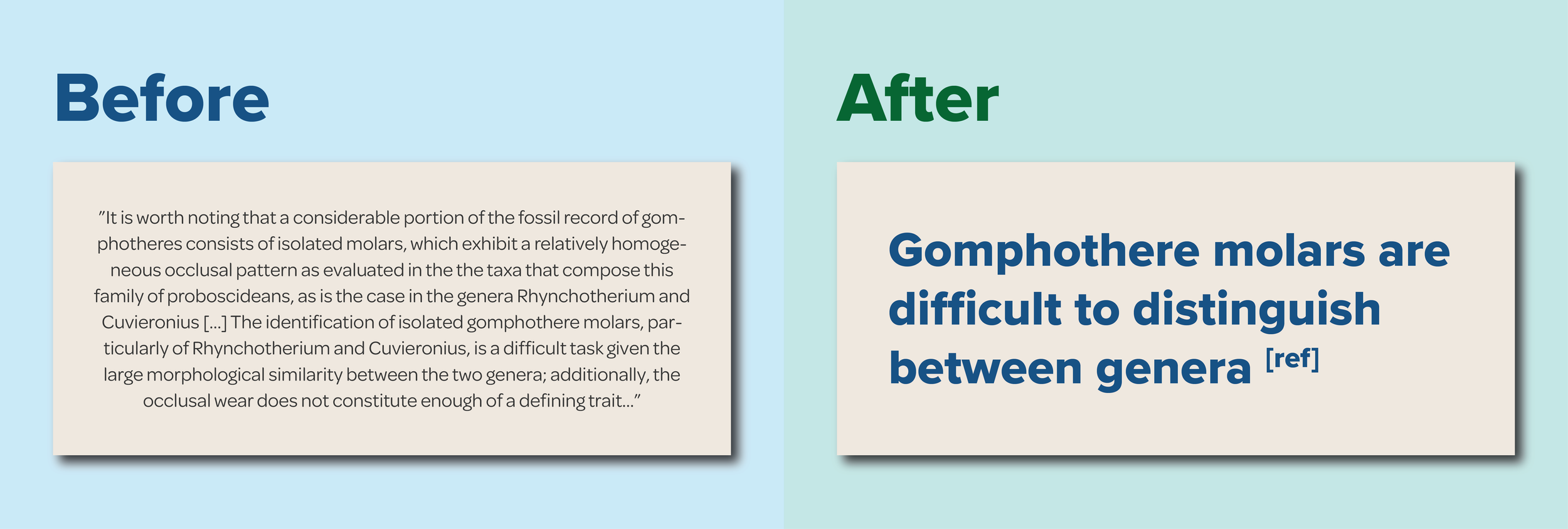
If we take my undergrad poster as an example, the answers would be the following:
Gomphothere molars are difficult to distinguish between genera. This is a problem when trying to identify isolated molars.
Can we identify the genus of gomphothere we’re dealing with based on the area of the chewing surface (occlusal area) of isolated fossil molars?
We measured the occlusal area of the third molars of 54 Rhynchotherium (11 upper & 23 lower) and 51 Cuvieronius (19 upper and 32 lower). We obtained the area by multiplying the length of each teeth by their width.
Our main finding was that the occlusal area of the teeth of Cuvieronius tends to be larger than that of Rhynchotherium.
Our take home message is that, if you only have isolated teeth, the occlusal area of the third molars of gomphotheres can aid in their taxonomic identification.
Aside from a few more pieces of text (e.g., labels, titles, highlights, acknowledgements, etc) the answers to the questions above constitute most of the text you are going to use for your poster. So no need to spend hours typing elaborate paragraphs explaining every single aspect of your study. Remember, you are going to be standing next to your poster, so if people want to know any additional information you are going to be there to answer those questions! Your poster needs to be informative enough to be understandable on its own, but succinct enough that people can gauge the main points easily.
How should the text be written?
Use the simplest language possible. Use short and concise sentences.
Avoid long paragraphs. If you must write text do it either as: captions/titles, labels or bullet points.
Avoid using too much technical language. If you have to use a specialist term, make sure to define it when you first use it. Remember that even within your discipline, not everyone will be familiar with the particulars of your own sub-field.
Trade excessive and overly-complicated paragraphs for concise sentences with easy-to-understand language.
Figures
Main figures
Now I want you to pick one or two figures that best portray your main findings. This is going to be the centrepiece of your poster. Therefore it has to be large and immediately obvious to the reader that this is what you found through your research. My recommendations for this main figure are the following:
Include a large, descriptive title above the figure that says exactly what your main findings are. If you’ve been following my instructions, you already have this text! In my case it would be: “Our main finding was that the occlusal area of the teeth of Cuvieronius tends to be larger than that of Rhynchotherium“. People shouldn’t have to guess what your main finding is- show it to them clear and simple.
If you’re using a figure from a paper, re-draw it:
Make sure it fits the space you’ve designated for it in the poster
Don’t try to stretch out paper figures for a poster- it doesn’t look good and can be difficult to read
Re-organise it if needed to avoid excessive white space
Reduce clutter. Include only what’s necessary.
Highlight the relevant parts of the figure using arrows and labels. This will help you avoid having an additional Results section made up of only text.

Re-draw your paper figures if you want to include them in your poster! Get rid of unnecessary information, add descriptive labels and make sure the format fits the rest of the poster.
Other figures
If you ever have the opportunity to turn text into figures, take it! The places were this can happen more commonly is the Background and the Materials & Methods. So for example, instead of having a bullet point that says: “We measured the occlusal area of the third molars of 54 Rhynchotherium (11 upper & 23 lower) and 51 Cuvieronius (19 upper and 32 lower). We obtained the area by multiplying the length of each teeth by their width“. You can instead have one drawing of Rhynchotherium and one of Cuvieronius with the number of teeth measured below each one of them, and a photo of a tooth showing how the measurements were taken. This way you will drastically reduce the amount of text in your poster.

If you get the chance of turning text into figures, take it! It’s much easier to understand and cuts down your word count significantly! Art by Luis Arturo Davalos.
Other figure recommendations:
If possible try to remove the white background of images. If you have Keynote you can easily do this with their “Instant Alpha” tool.
If possible, avoid picture backgrounds. They decrease the legibility of your text.
Putting everything together
Now you have both the text and the figures you want to include but, how do you actually put them together?
For starters, refer back to your poster specifications and create a document with the required characteristics.
The information in your poster needs to follow a logical structure. Your poster needs to be structured the same way people read (in many Western countries people read from left to right and from top to bottom). There’s many ways to stick by this rule. Biorender has a really good diagram on how your information should flow in your graphic, which I show below. If you want, you can sketch out the structure of your poster in a piece of paper, this will help you visualise the ideal flow for your story.
The formatting of the text needs to be hierarchical and consistent throughout. For example, the title is going to have the largest font, followed by headings, main text and finally captions. You might want to give a certain colour to headings and highlights, and a different one for the main text. Whatever you choose is fine. Just: 1) keep it consistent, 2) don’t choose more that 2 fonts and 2-3 font colours, and 3) remember it needs to be accessible.
Remember: the figures need to be the main focus of the poster, not the text. The text of a poster is there to support the figures and guide the reader through the story you’re trying to tell.
Make sure to align and distribute the elements in your poster. There is an align and distribute tool in software like PowerPoint and Adobe Illustrator. Also, include enough white space between elements to balance them out.
It’s also a good idea to have one minute verbal explanation of your poster. In conferences people will often come to you and ask you to walk them through your poster. Make sure to keep your speech engaging!

A series of recommendations for putting your poster together. Flow of information diagram from BioRender’s “Figure making workshop”.
Now that we know how to assemble a poster, let me walk you through how I transformed my horrendous undergrad poster into something much better.
Ok so the first thing we’re going to do is point out everything that is wrong with this poster. Overall, it has way too much text and unnecessary detail, the language is suited for a paper rather than a poster, the most relevant information is buried in the Results section and the figures are too small.

Dissecting my undergrad poster: there’s a lot of things wrong with it. (Bonus: don’t use Times New Roman for a poster, use a sans serif font)
If we remove the text, and only look at where the different sections are we end up with this:

Overall structure of my undergrad poster
There are too many sections and some of them are not every properly aligned. Let’s change this poor structure into something that is easier to read, has a logical structure, captures the attention of the reader and highlights the main points. While the original poster was in portrait mode, I decided to change it to landscape. Personally I prefer posters in landscape mode because they’re ideal for sharing in Twitter, but this is solely a personal preference.

Proposed new structure for re-designing my old poster. If you want, you can use this as a template for your own!
The image above shows a much neater version of the poster’s original structure. It has all the background & methods used on the left and the results & conclusions on the right. You can even use this structure as a template for your own posters! Here, I’d like to point out some things:
Wherever there are text boxes for you to fill, it does not mean that you should aim to fill the entire box with paragraphs of text. Only write whatever is truly necessary, and if possible use labelled images to convey your message.
The boxes are only there for guidance. It doesn’t mean you have to keep them there. You can also re-size them as you see fit. Make sure to balance the different sections with white space (i.e., leave space between elements & around the edges of the poster).
I love having a big statement on top of the main figure/graph where I explicitly say what the main finding of the study was. That way people don’t have to spend time looking for it or trying to deduce it.
Make your main figure/graph as big as possible and use labels to point out relevant stuff about it. This should be the highlight of your poster.
If you use any photos or art that you didn’t take/make, always remember to credit the artist! You don’t have to make everything from scratch, but it’s important to acknowledge whoever did it.
Before I think of making the poster “pretty”, I’m just going to add the relevant information into the template above. It’s going to include the following:
On the left hand side of the poster:
Title and authors: You don’t need to write the full affiliation of all the authors, a logo is a good way of getting around this issue. Also, try to find logos with transparent backgrounds (you can easily find them by going to Tools>Colour>Transparent in Google Images) or try to remove the background somehow (if you have Keynote, you can do this really easily by selecting your image and going to Image>Instant Alpha).
Background: One or two sentences that state what the problem is/why your study is important. Try to use visual aids here. You don’t even need to call the section “Background” or “Introduction”- its position towards the top left corner of the poster will make it obvious.
Materials & Methods: Again, you don’t even need to call it “Materials & Methods”. Instead try opening with a sentence like “We wanted to see this… therefore we did this…”. Also try to use visual aids here to show, for example, your materials, the measurements you took, the analyses you ran, the software you used. Note: Don’t include absolutely everything you did, just enough for people to understand what’s going on.
On the right hand side of the poster:
The main finding of your poster in big, bold letters. Make this sentence easy to understand. Don’t make it complicated or use very technical language. This sentence needs to stand out, don’t try to bury it within a paragraph.
Your main results figure(s):
This can be a photo, a graph, the results of an analysis, etc. If possible, try to stick to one or maybe two figures. Again, this is not a paper and there’s no need to include the same figures you would have in a paper.
Likewise, the formatting of a paper figure will be different to that of a poster. Oftentimes, if you use a figure straight from a paper they will be too small to be properly read. So re-draw your figure! You can easily trace it in PowerPoint, Illustrator, Inkscape, etc.
Declutter as much as possible. If, for example, there’s information in the paper figure that is not relevant for the poster, get rid of it. For example, in a paper I might have a scatter plot of a hundred data points all labelled individually. This would be overkill for a poster. Remove the labels and only point out the relevant data points. Or maybe colour code them by groups. This is not the same as doctoring your results, please don’t do that!
Use arrows and labels to point out relevant information within your figure. This will save you from having a text-heavy Results section and the reader will understand the point you’re trying to get across more easily.
A take home message. Remember to make this easy to understand!
On the bottom of the poster, please remember to acknowledge all the people that helped you carry out your research and if you used any photos or art that wasn’t created by you, please acknowledge the artist! I often ask for their permission and like including their websites if possible, but it’s not strictly necessary. You can also add your bibliography in this section. Try using a short citation style to save space.

Adding the information to the template. Can you see how many words I’ve cut down here? Art by Luis Arturo Davalos.
This is already looking so much better. As you can see almost all the text is gone. However, I’m not really losing the essence of the poster. When I went back and read my original poster I realised I had rambled on and on for seven paragraphs, when my study really only boiled down to one thing: one of the gomphotheres tends to have molars with a larger chewing area than the other one. Did I really need seven paragraphs to say that? Absolutely not!
Now that all the relevant information is in place, I can actually move on to making the poster look nicer. For that, I did the following:
Background: I used a very subtle gradient for the background. This makes the poster a bit more interesting while still retaining legibility. Please avoid picture backgrounds, they make posters lose legibility (especially for people with dyslexia).
Text colour: I decided to use a magenta colour for the text I wanted to highlight (title, main finding, conclusions) and dark grey text for the rest.
Colour coding & labelling: Because the study dealt with two genera of gomphotheres- Rhynchotherium and Cuvieronius- I decided to assign each a colour and made sure every time I mentioned them (or included them in a graph), their colours were constant. This way, you can easily and quickly separate them visually. Make sure that when you colour code elements in a graphic you make sure the palette you’re using is colour blind friendly. Also, don’t just rely on colour- what if someone prints your graphic in Black & White?

The final re-designed poster. I’ve transformed seven paragraphs, one table, a map and two figures into a poster that is more easy to understand. I re-sized the content a bit (compared to the previous one) to make sure there was enough blank space around the edges. Art by Luis Arturo Davalos.
And there we have it! A completely re-designed poster. There might be a few more bits I’d include for a conference poster, but they’re only details- maybe some labels here and there. But 95% of the relevant content of the poster is here already. Before you send it out to the printer, make sure to double-check everything for typos and do accessibility checks. You can try running it through a colourblindness simulator and/or a greyscale one to make sure it’s still understandable in both situations. You can even print it out in an A4 piece of paper to make sure everything looks ok when printed.
I hope that you have found this blog post useful. I just want to conclude by saying the following: science is meant to be communicated, both to other scientists and to non-scientists as well. You can choose to make a text-heavy poster with complex sentences, lots of technical language and not pay attention to your figures. If you do this, some people might understand what you’re trying to convey with your poster, but a large chunk of your audience will either not understand it or not even bother trying to. This means that you’re not communicating effectively. And sure, you might only be interested in a couple of people in your particular sub-field understanding your poster. But then, what’s the point of making the poster? You might as well just email them your paper. You might be missing out on exciting collaborations with people outside your field because you didn’t think they were relevant enough to understand your work. The same goes for making your poster accessible: do not exclude people from the results of your research.
Posters are a great tool for communicating your research and allow you to establish a conversation with people you might benefit from knowing- they might be your future advisors, collaborators or students. I hope you have a great time making and presenting your posters, and if you’re ever in need of help I’m always happy to help!
The palaeoart used in the redesigned poster was made by Luis Arturo Davalos. You can find his art in DeviantArt and Instagram.